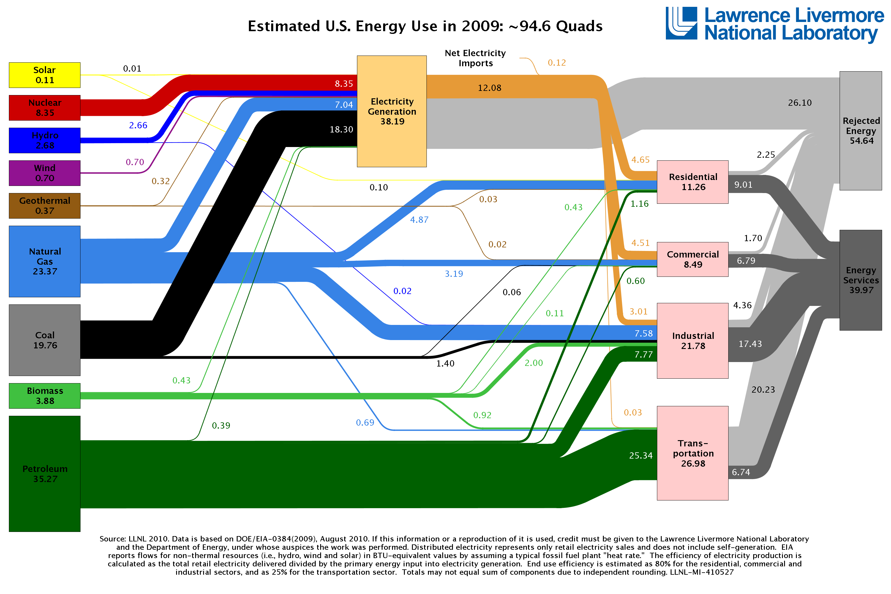
For my upcoming presentation at the ATA Conference in Boston, I was thinking about using
this chart to illustrate the energy sector in the US in general – until I noticed that it has a severe flaw: the blocks on the left and right should be exactly the same size going up and down.
Now, I see that Bloomberg has come up with a really fantastic interactive version of basically the same information and has gotten rid of that beginner's mistake.
Check it out for yourself.